Audits & Inspections App
Remedy Interactive's Safety Management Software
ToDo, Worksheet and IMS modules.
Project Brief
Remedy Interactive's To-Do List app, a mobile application that allows users to accomplish individual or set's of task's anywhere, perform safety audits, inspections or individual tasks quickly and easily.
Use Case / Problem
Workplace safety professionals and schedulers are often called onsite to perform task's as part of an audit or inspection. Since most of the assessment software currently available is either web based and requires a desktop class browser, or performed manually, using an inspection form worksheet on paper, a mobile solution is needed.
This will allow users to perform tasks as part of an audit or inspection via a worksheet in digital form, complete individual tasks, review, submit or reject tasks and view information about their tasks assigned to them or that they have assigned to others on their mobile phone and submit finished forms over the network for further processing.
The goal
Creating a flow that keeps users on the go, working and engaged, promoting Corrective Action (task) completion.
UX Task
Develop an interface that is user friendly, allowing our users to complete tasks as part of an audit or inspection without the need for a desktop computer or paper form. The user will be able to submit forms and save work to be submitted later when there is no network available.
To Do List on web and mobile
-
Change of Context
- Enterprise, business application for mobile professionals who don’t use mobile applications.
- Change of Behavior
- From manual data recording and entering to web forms, and ultimately to mobile.
- Must be easy to use
- Our users range on the older side and many don’t use smartphones heavily and majority have never used them for work purposes in this context.
- Must be encouraging to use
- To motivate immediate task completion
- Reducing workload by completing small fixes on-site, better safety compliance
Worksheet on web and mobile
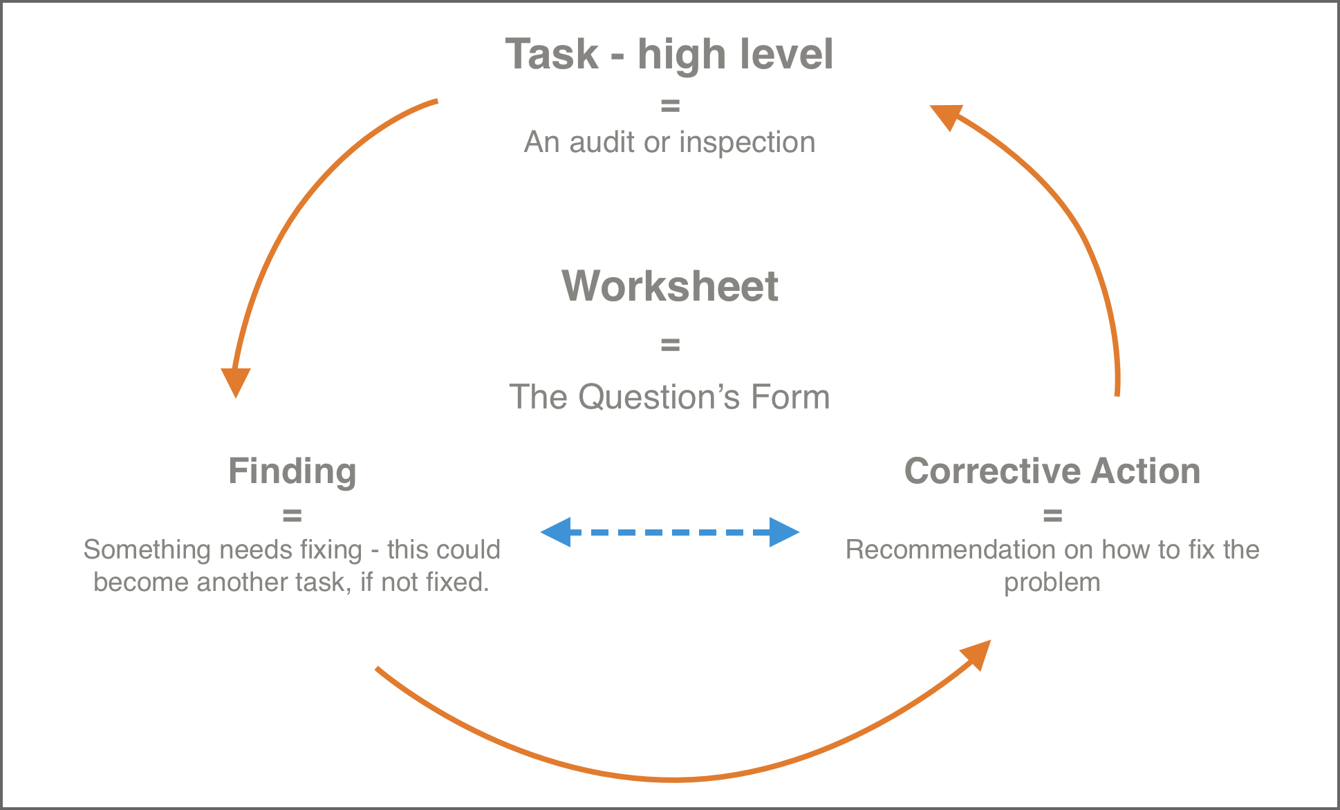
Process driven architecture
When working on enterprise software, I found I needed to compartmentilze the design, so I made the app very modulelar to quickly change and adjust with client requirement demands.
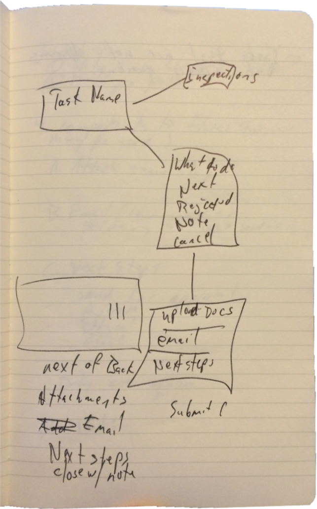
Sketching conceptual UI's
Brainstorming application use cases and flows
Knowing our users
User research, survey's & persona's
Example Survey Questions
Mobile device usage.
- Do you use a smartphone?
- Do you use a tablet?
Which best describes your working preference?
- I prefer working at my desk on my computer.
- I prefer to be out and about, using my phone for work as much as I can.
- I like to use both.
Which best describes your working preference?
- I prefer working at my desk on my computer.
- I prefer to be out and about, using my phone for work as much as I can.
- I like to use both.
Persona Example A - Adam
Early ToDo View Iteration
Issue
Too much info in a small space.
Final ToDo View Iteration
Solution
Prioritize the most important information to display to users that is both readable, increasing glancability, and tappable.
Easy to use on a job-site.
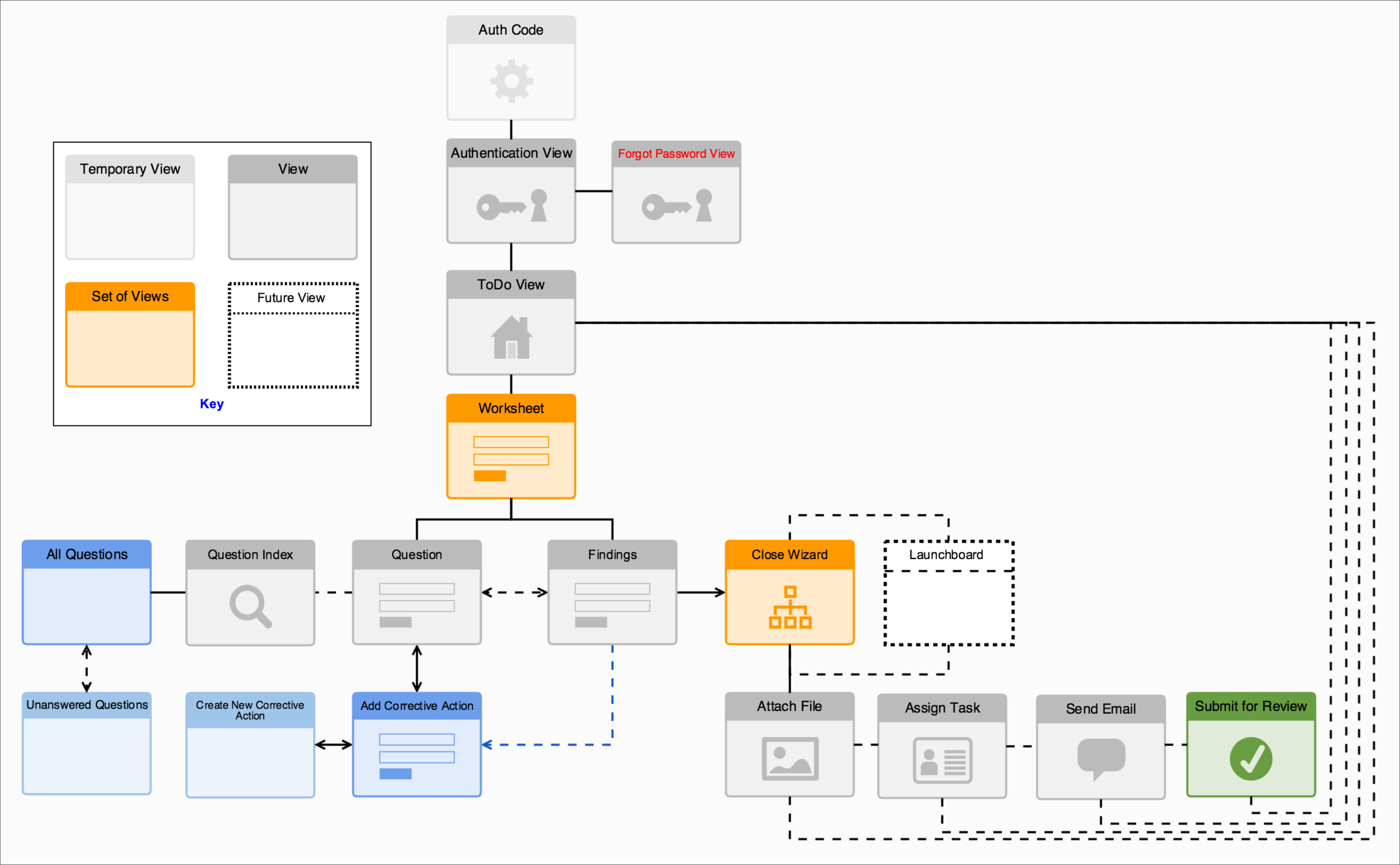
Complex architecture aligning with existing web-app
Solution: User Flows
Site Map
Conceptual Process Flow
Breaking complex tasks with multiple actions down into organization, creating a design language, outlining it for stakeholders and developers
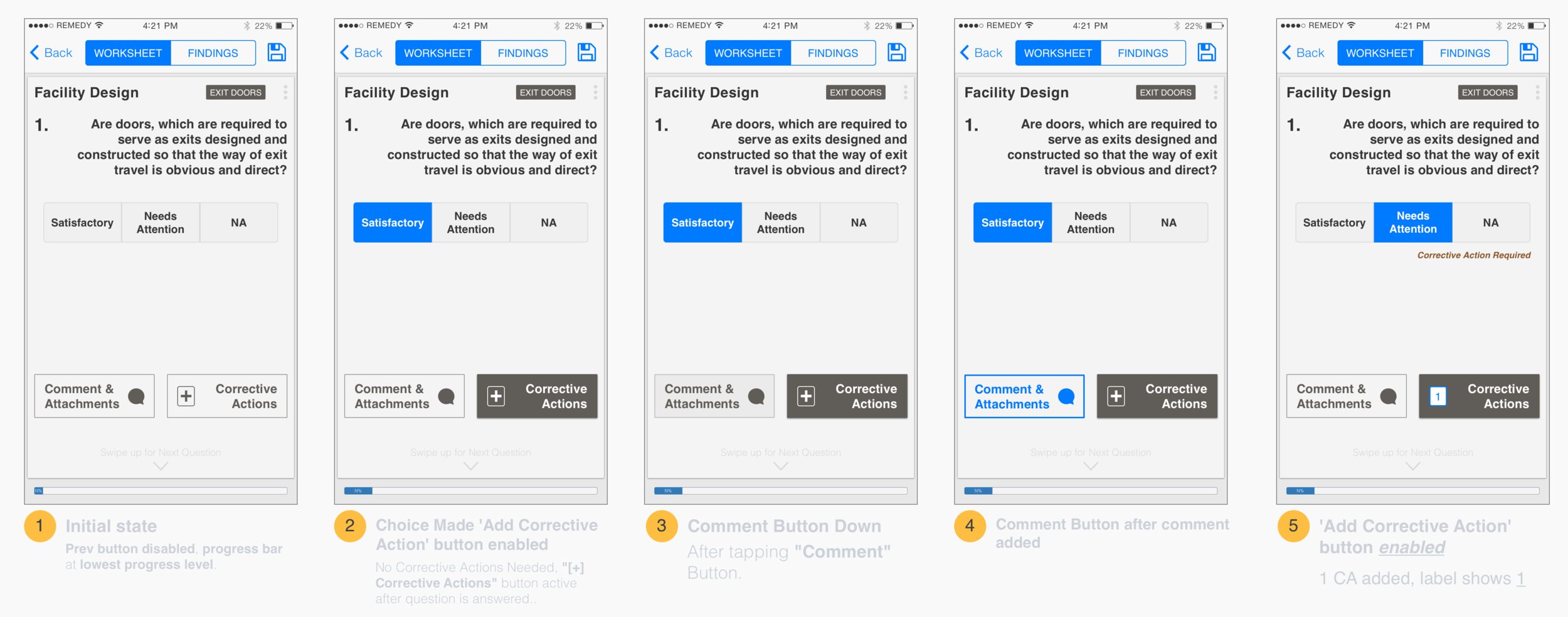
Solution: Task Analysis
Fill out a safety inspection worksheet
- Login
- Find desired safety inspection task
- Tap on the task
- Answer questions on worksheet
- Tap 'Summary' on final question to proceed to next step.
Find a specific question on worksheet while viewing different question
- Login
- Find desired safety inspection task
- Tap on the task
- From within a worksheet question
- Tap on 'More' icon or tap on 'Worksheet' in toggle Tap on desired question
- Reveals question index
Usability Testing
Testing form layout and iconography
Through usability testing, we were able to pinpoint problems with navigation that were confusing users.
The solution was to simplify the layout, reducing clutter and implement a swipe to navigate gesture.
Testing several versions navigation layouts
We found that users were quick to tap in an area that slowed down the flow of task completion.
The solution was to switch the layout of certain views in the opposite order, improving the flow.
Iconography was also improved through simple usability testing.
Tools I used
Manual labor: A Moleskine notebook, graph paper pad and a pen.
Software: Sketch by Bohemian Coding, OmniGraffle by The Omni Group and Zeplin (these are just a few, but important to my workflow).
Web-apps: Optimal Workshop for user research and usability testing and recording, Marvel for prototyping, Trello for sharing designs with the team, Confluence and Jira, Typeform for surveys.
Technology we worked with
The application was built to be deployed cross platform. More specifically, iOS on the iPhone and Android. Written in HTML5 by our development team, we used PhoneGap / Cordova for native-like device functionality, AngularJS JavaScript framework and Ionic Framework for styling and compiling.


