Web Projects
# File Browsing Interface
At SpiderOak we used Twitter’s Bootstrap framework for the web, and creating similar styles as I had used in designing the mobile application’s for iOS and Android devices.
My focus was to create an experience that was consistent across platforms and devices.
This meant merging the style and structure of the redesigned mobile applications to the web.
#List & Icon Grid Views
Browsing files can be monotonous. I created a design that's rich with important information about the user's account and files.
#Viewing Files
Accessibility, ease-of-use and scalability. Those are my goals for creating an easy to use file browsing web app. With clear and concise, contextually driven tooltips, smart and thought out UI elements, this layout allows for browsing ease. Even if you have large amounts of data.
#ShareRoom File Upload Drag & Drop
Screenshots
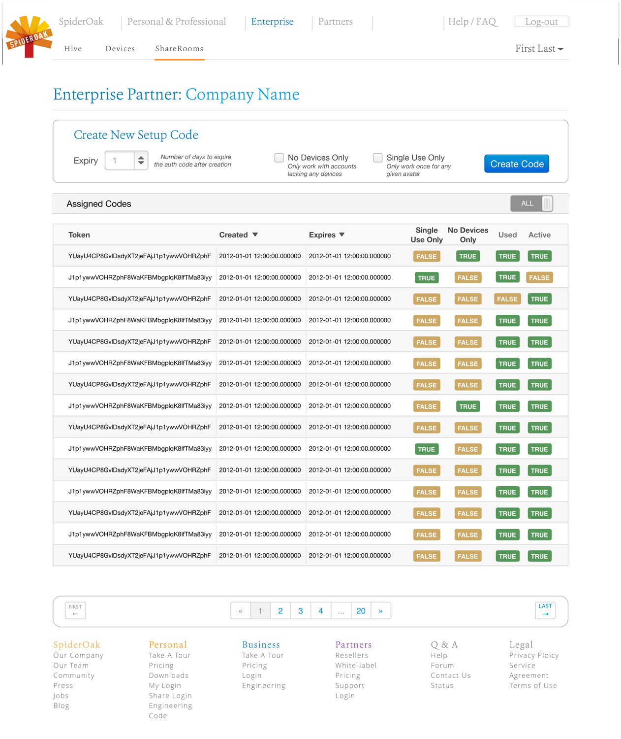
#Administration Management
Continuing along to the administration sections of the web app, keeping the overall style and consisitancy of the site was of the utmost importance.
My goal here was to help the user make sense of the data and user lists.
#New User Authentication
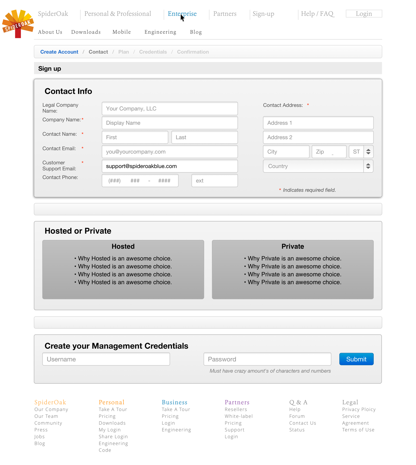
#Product / Service Signup Process
My goal here was to create a signup flow that could be completed on one page.
The navigation bar uses 'breadcrumbs' and updates depending on the section that is active.
#Information Architecture
#Ark
I designed the internal content structure for several pages of the Ark V2 prototype.
My task was to create a concept of what the 'Shop' section of the site would look like. The first active sub-navigation module, 'Featured', was designed to show off top products from featured stores in the network. 'All Stores' features the ability to view the featured products within a carousel on mouse-over. 'Today's Deals' focuses on location-based personalization.


