Web App UX Design
File Browsing Interface
Issue addressed
The goal was to create a simple interface for our users to interact with their files through a complex system like SpiderOak. In addition to current features, we wanted a structured framework to allow the interface to be scaleable over time as we added more features.
My focus was to create an experience that was consistent across platforms and devices.
This meant merging the style and structure of the redesigned mobile applications to the web.
Approach
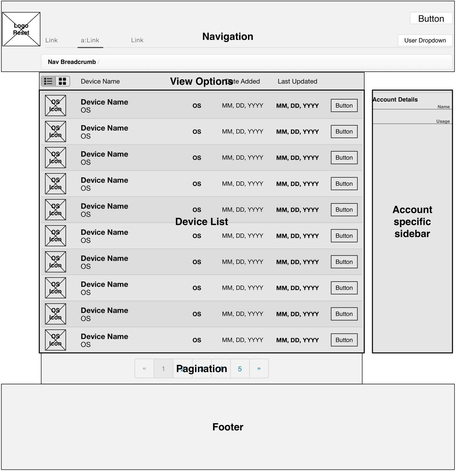
I approached the task by doing a competitor analysis of the top five file backup companies in our space. I wanted the user to have different ways of viewing their files, similar to that of a desktop computer.
Alternatives considered
Although we considered using ZURB's Fondation, for it's menu implementation, SpiderOak we used the Twitter Bootstrap framework for the web.
My role and work performed
As lead designer, I helped conduct brainstorming sessions which led to improvements of the interface, as well as ideas for future products and features. I designed several different layouts and UI elements, creating the storyboards and wireframes to explain the user-flow.
Tools used
- OmniGraffle and Sketch - storyboards and mockups
- Adobe Illustrator - vector graphics
- Adobe Photoshop - bitmap graphics
- Outlining apps - information architecture, structure of user-flows
- Prototyping (web)-apps - simulate user-flows, find potential issues.
Outcome
One positive business outcome was an increase in user signups for free and paid accounts. The design outcome was a domino effect. The redesign for one part of the web-app interface created the need to redesign our entire file browsing and account management.
Concurrent projects
Projects included the administrator management console for our enterprise customers, as well as SpiderOak's mobile application, which was in the development stage of production.
Lessons learned
I would have liked to have had a more elaborate beta program, bringing in individuals to interview and observe. Because of the need to protect anonymity and privacy of SpiderOak accounts, I would create a set of 20 (or so) dummy accounts, filling them with a sampling of random data. In addition, I would do more extensive A/B testing with alternative layouts and designs. Asking questions like:
What are the most used features?
How can we make them better?
Should we get rid of elements not as popular or make them serve better functions?


