After a major OS release, you can typically count on application updates from developers. With iOS 8, there was also the launching of iCloud Drive which involved major changes to the structure of the data we store and access in iCloud. Most of these updates happened in the background, and don’t require our attention.
But some apps do require our attention. I tend to read the release notes [1] with app updates on my Mac and devices. I find them interesting/useful. I’ve been finding an alarming trend with developers warning users to take actions before updating their apps. They range from problems with an update crashing on launch and recommending to skip the version and wait for the next update to telling users to make a backup of their data before updating.
App developers cautioning users to make a backup of your iCloud data before updating the app doesn’t work.
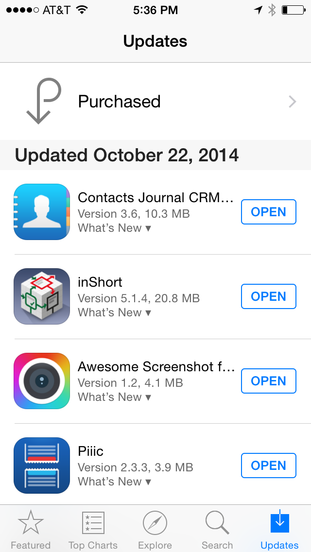
Typical App Store Updates view.
Like this one:
Important Note for iCloud users: if you sync Contacts Journal with iCloud, please backup your data before updating the app. You can create a backup from More -> Manage Data > Backup iCloud Data.
If I’m reading your warning, it’s probably already too late.
There’s a fundamental problem with these types of warnings. In most cases, 1) assume your users don’t read release notes. Cause they don’t. 2) With Automatic Updates turned on in iOS, chances are good, they’ll be unable to stop the update.
One could argue that developers should issue ample warning in the previous versions, allowing users to plan ahead. However, that doesn’t help with users who don’t read release notes.
But the reality is, the iOS App Store needs a delayed download and update feature like the Mac App Store. In addition, developers could request to Apple that users have to initiate the update manually after highlighting where to read the release notes. Users would launch the App Store and see a separate notice, saying something like, “there were a few updates that require your attention”.
Pending Updates view concept
Users can choose to take appropriate precautions, or just manually start the download. The action wouldn’t add much time to the whole workflow, and the users would have a chance to backup important data.
The example above includes:
- A separate section above 'Pending Updates' for updates that need review.
- A header containing the number of updates that need review.
- A unique badge that grabs the users eye and attention, in this case I used an orange Info icon (i).
-
That “What’s New” text below the version number. ↩
