Re: Your annoying Fwd:

This tip comes from How to Quote Text in an Email Reply on the iPhone Download Blog.

Do you get annoyed with people that just forward emails without asking themselves, why am I forwarding this? Well I don’t like getting emails that are a mile long, and the actual message 3/4 down buried in the message. Typically, if I see more than 3 or 4 lines down the left side of the email, I won’t even start to read it. If it’s not reworded, reformatted or explained, it’s obviously not important enough for me to read. It’s really a pet peeve of mine.

I love reading articles on email etiquette and learning new methods that improve readability. It’s not often I learn a new shortcut or tip for the iPhone. But I found this yesterday, and think it’s pretty nice.

So you have an email that needs repeating. Before you go on and forward it half of the country, ask yourself what you’re sending. If it’s a part of the email, then let me know and quote it.

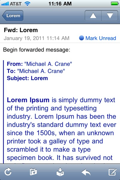
lorem_email_originaltext.png

So here’s the email

lorem_email_badexample.png

Here’s what it looks like when you forward it.

Once


But I know you just want a line or two. So, find the line and select it as if you were going to copy it. — Now that the text is selected, you can go ahead and hit the reply or forward button.

lorem_email_finalquote.png

Now doesn’t that look better? If there ends up being 2 or 3 back-and-forths, it’s going to be easier to read and reference back to…

for both of us.


Read the original article here.

Source: http://www.iphonedownloadblog.com/2010/11/...

iOS 4.2

New choices for SMS ring-tones are nice, but a bit overdue. I kinda like ‘Sherwood Forest’. But I gotta say, these are not exactly text-message tones IMHO ;). Way too long and obnoxious. Though I guess in a way it’s fitting considering how we’ve changed from the default of calling people to texting. In addition, tone’s are now assignable on a per-contact basis, also a bit overdue.

But the really cool, awesome, crazy new feature… Voice Memos new icon!

AirPrint, ah yes the AirPrint (phantom) feature. If you’re like “AirPrint yes! Wait - WTF I can’t get it to work?!”, that’s normal. Native AirPrint support was not shipped with 10.6.5. Unless you have an AirPrint enabled printer, head on over to this site to hack your Mac a bit. I did it, it works, nuff said.

AirPlay, I don’t have AirPlay enabled speakers, so I won’t be testing it anytime soon. You’ll let me know how it is.

One thing that deserves mentioning, ‘Find My iPhone’ is now available for free, which is great. This was originally only to MobileMe members. Although, Apple should be giving the whole MobileMe package away for free considering alternatives like Google Sync and the reduced feature set. I’m not exactly sure why it’s considered a 4.2 feature update, it’s more like a policy, mmm?

4.2 is really an update to bring the iPad up to speed. There are a several under the hood updates/changes here and there, mostly subtle from what I’ve seen. I’m sure I’ll notice more in the next week. Correct me if I’m wrong but birthday presents next to your birthday calendar events, new? Ehh.

There goes my Magic Mouse connection again. Firmware update anytime now Apple. Yes this update bored me, yawn.

Mobile Safari Gmail redesign

Google recently updated their Gmail web interface for the iPhone in Mobile Safari. The changes are subtle, but effective. They describe how the interface redesign makes Gmail act more like a native app, and they’re right. But there are some differences that make this new look work more intuitively than a web-app or a native app. A hybrid of the sort, allowing the unique qualities of native app with the full functionality of living within the browser.

The first thing you’ll notice when logging into Gmail, the Safari navigation toolbar disappears. One thing about native applications, given that users are not in a browser, normally no navigation toolbar exists to enter in a URL, you don’t need it.

Full-Screen Mode

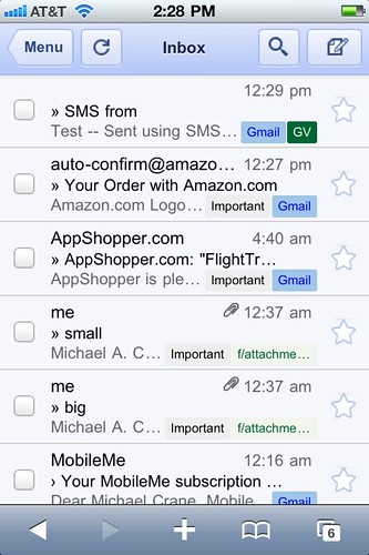
Gmail in “Full-Screen Mode” with a fixed-position toolbar.

Gmail’s prior version also had a fixed toolbar with the same navigation UI elements, but the difference was in the placement. It was very cluttered originally, with your controls fixed on the side. The effect was that of a toolbar following your every move. Quite annoying when you are trying to scan your inbox. This time around, it’s affixed to the top status-bar, clean and out of the user’s way.

This is one of my favorite part’s to the redesign. Prior versions might have hid the navigation toolbar at first launch, but when you would pull down to scroll, the URL would reappear. No reappearing now.

Full-Screen Mode

Safari navigation toolbar hidden, giving Gmail “Full-Screen Mode” with a fixed-position toolbar.

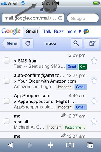
But we are still in a browser at the end of the day, so we can’t be sandboxed in. By tapping the status-bar just as if you were trying to scroll to the top in Safari, not only will you fly to the top, but our old friend re-appears. When the user scrolls back down, the toolbar hides once again.

Top Tap

iPhone status bar revealing the Safari toolbar.

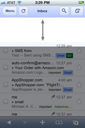
They also made some crazy improvements to the page load speed and caching. When one flick’s their finger to scroll down quickly, normally you see a bit of that loading “checkerboard” effect. Scrolling now is more like a momentum-driven gliding.

Fluid Scrolling

While scrolling the Gmail toolbar remains fixed in a better, less obtrusive way than before. Scrolling is also much faster, without the “checkerboard” loading look.

Google keeps impressing me by how much they look into improving the iPhone’s UI. Considering Google is now competing directly with Apple, I think they are clearly taking the higher road. When Apple has a petty dispute over an app they may try to release, that’s when the true innovations come. With the Google Voice HTML5 breakthrough, YouTube and now Gmail, my hat goes off to them.

Printing from your iOS-Device wirelessly

For Mac users:

I love this kind of tip. I have an app on my iPhone where I can print webpages or whatever I last copied to my clipboard, but this solution is much better.

This tip is from a Lifehacker article by Aaron Ladage (@aladage). It uses Automator, an easy to use application for creating automated workflows. It’s also pre-installed on every Mac.

First things first, if you don't have a Dropbox account, create one here (Dropbox referral link), it’s free. Next, here are the steps directly from the article:

  1. Create a folder in Dropbox (mine’s called “Printing”), and within that folder make two more folders: “todo” and “completed.” Then, fire up Automator. In 10.6, a box pops up asking you what type of template you want to use for your workflow. Choose “Folder Actions.”

  2. At the top of the workflow, where it says “Folder Action receives files and folders added to…” choose the “todo” folder you created in your Dropbox. Then, in Automator’s search box, type “print” and you'll see an item called “Print Finder Items.” Drag that into your workflow and select your printer (I left mine as default). Go back to Automator’s search box and type “move”. You'll see an item called “Move Finder items.” Add it to your workflow and choose the “completed” folder you created at the beginning. Choose “Save as…” and give your workflow a name.

  3. That’s it! Anything you drop in the “todo” folder (Ed. note: Which you can do from any phone or computer with Dropbox installed and connected to your home computer) will now automatically open its respective app, print it and file it for you.

I tested it out last night, works as advertised. Very cool stuff using Automator.

Here is a similar concept for Windows users, although I haven't tried that one out.

Source: http://lifehacker.com/5653084/print-files-...