Google recently updated their Gmail web interface for the iPhone in Mobile Safari. The changes are subtle, but effective. They describe how the interface redesign makes Gmail act more like a native app, and they’re right. But there are some differences that make this new look work more intuitively than a web-app or a native app. A hybrid of the sort, allowing the unique qualities of native app with the full functionality of living within the browser.
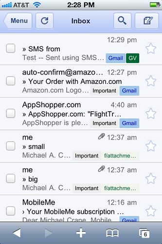
The first thing you’ll notice when logging into Gmail, the Safari navigation toolbar disappears. One thing about native applications, given that users are not in a browser, normally no navigation toolbar exists to enter in a URL, you don’t need it.

Gmail in “Full-Screen Mode” with a fixed-position toolbar.
Gmail’s prior version also had a fixed toolbar with the same navigation UI elements, but the difference was in the placement. It was very cluttered originally, with your controls fixed on the side. The effect was that of a toolbar following your every move. Quite annoying when you are trying to scan your inbox. This time around, it’s affixed to the top status-bar, clean and out of the user’s way.
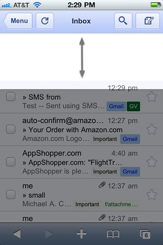
This is one of my favorite part’s to the redesign. Prior versions might have hid the navigation toolbar at first launch, but when you would pull down to scroll, the URL would reappear. No reappearing now.

Safari navigation toolbar hidden, giving Gmail “Full-Screen Mode” with a fixed-position toolbar.
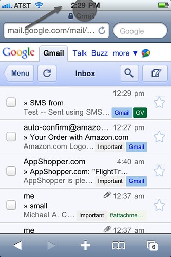
But we are still in a browser at the end of the day, so we can’t be sandboxed in. By tapping the status-bar just as if you were trying to scroll to the top in Safari, not only will you fly to the top, but our old friend re-appears. When the user scrolls back down, the toolbar hides once again.

iPhone status bar revealing the Safari toolbar.
They also made some crazy improvements to the page load speed and caching. When one flick’s their finger to scroll down quickly, normally you see a bit of that loading “checkerboard” effect. Scrolling now is more like a momentum-driven gliding.

While scrolling the Gmail toolbar remains fixed in a better, less obtrusive way than before. Scrolling is also much faster, without the “checkerboard” loading look.
Google keeps impressing me by how much they look into improving the iPhone’s UI. Considering Google is now competing directly with Apple, I think they are clearly taking the higher road. When Apple has a petty dispute over an app they may try to release, that’s when the true innovations come. With the Google Voice HTML5 breakthrough, YouTube and now Gmail, my hat goes off to them.