iOS 4.2

New choices for SMS ring-tones are nice, but a bit overdue. I kinda like ‘Sherwood Forest’. But I gotta say, these are not exactly text-message tones IMHO ;). Way too long and obnoxious. Though I guess in a way it’s fitting considering how we’ve changed from the default of calling people to texting. In addition, tone’s are now assignable on a per-contact basis, also a bit overdue.

But the really cool, awesome, crazy new feature… Voice Memos new icon!

AirPrint, ah yes the AirPrint (phantom) feature. If you’re like “AirPrint yes! Wait - WTF I can’t get it to work?!”, that’s normal. Native AirPrint support was not shipped with 10.6.5. Unless you have an AirPrint enabled printer, head on over to this site to hack your Mac a bit. I did it, it works, nuff said.

AirPlay, I don’t have AirPlay enabled speakers, so I won’t be testing it anytime soon. You’ll let me know how it is.

One thing that deserves mentioning, ‘Find My iPhone’ is now available for free, which is great. This was originally only to MobileMe members. Although, Apple should be giving the whole MobileMe package away for free considering alternatives like Google Sync and the reduced feature set. I’m not exactly sure why it’s considered a 4.2 feature update, it’s more like a policy, mmm?

4.2 is really an update to bring the iPad up to speed. There are a several under the hood updates/changes here and there, mostly subtle from what I’ve seen. I’m sure I’ll notice more in the next week. Correct me if I’m wrong but birthday presents next to your birthday calendar events, new? Ehh.

There goes my Magic Mouse connection again. Firmware update anytime now Apple. Yes this update bored me, yawn.
Mobile Safari Gmail redesign

Google recently updated their Gmail web interface for the iPhone in Mobile Safari. The changes are subtle, but effective. They describe how the interface redesign makes Gmail act more like a native app, and they’re right. But there are some differences that make this new look work more intuitively than a web-app or a native app. A hybrid of the sort, allowing the unique qualities of native app with the full functionality of living within the browser.

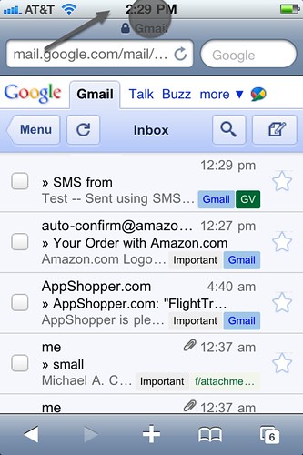
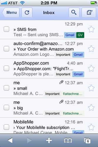
The first thing you’ll notice when logging into Gmail, the Safari navigation toolbar disappears. One thing about native applications, given that users are not in a browser, normally no navigation toolbar exists to enter in a URL, you don’t need it.

Full-Screen Mode

Gmail in “Full-Screen Mode” with a fixed-position toolbar.

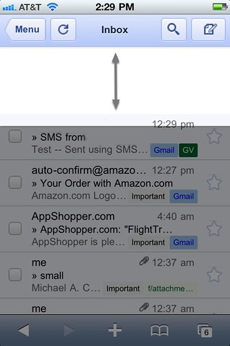
Gmail’s prior version also had a fixed toolbar with the same navigation UI elements, but the difference was in the placement. It was very cluttered originally, with your controls fixed on the side. The effect was that of a toolbar following your every move. Quite annoying when you are trying to scan your inbox. This time around, it’s affixed to the top status-bar, clean and out of the user’s way.

This is one of my favorite part’s to the redesign. Prior versions might have hid the navigation toolbar at first launch, but when you would pull down to scroll, the URL would reappear. No reappearing now.

Full-Screen Mode

Safari navigation toolbar hidden, giving Gmail “Full-Screen Mode” with a fixed-position toolbar.

But we are still in a browser at the end of the day, so we can’t be sandboxed in. By tapping the status-bar just as if you were trying to scroll to the top in Safari, not only will you fly to the top, but our old friend re-appears. When the user scrolls back down, the toolbar hides once again.

Top Tap

iPhone status bar revealing the Safari toolbar.

They also made some crazy improvements to the page load speed and caching. When one flick’s their finger to scroll down quickly, normally you see a bit of that loading “checkerboard” effect. Scrolling now is more like a momentum-driven gliding.

Fluid Scrolling

While scrolling the Gmail toolbar remains fixed in a better, less obtrusive way than before. Scrolling is also much faster, without the “checkerboard” loading look.

Google keeps impressing me by how much they look into improving the iPhone’s UI. Considering Google is now competing directly with Apple, I think they are clearly taking the higher road. When Apple has a petty dispute over an app they may try to release, that’s when the true innovations come. With the Google Voice HTML5 breakthrough, YouTube and now Gmail, my hat goes off to them.

iPhone YouTube upload comparison

With the release of the iOS 4.1 update for the iPhone, users can now decide whether they would like to upload their videos in standard or high definition.

  • This video was uploaded in SD
  • and this in HD

Make sure that the settings are set to the highest resolution (320p or 720p).

Let me know what you think in the comments section. Is it noticeable? Do you care about the clarity of videos when it’s on YouTube? I do.

iOS 4.1 update is now live

My recommendation for updating:

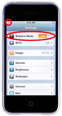
  • Go to Settings ➜ Turn Airplane Mode ON
  • backup your phone in iTunes

    • By turning Airplane mode on, this reduces the chance of getting interrupted by a phone call, text, or push notification
    • It’s also is a lot faster


(Photo from www.cultofmac.com)

What is that?

There was some sort of pressure buildup in the sewers the other night in front of my place. Probably triggered somehow the storm earlier. So I figured what a better way to test out the new iPhone 4’s camera and video capabilities was to post this video. Keep in mind I am not a film maker, although I did stay at a Holiday Inn last night.

There’s been fantastic storms this year.