SpiderOak for iOS 2.0

Well, I'm excited to announce after working on this project for over a year now, the app is done. The SpiderOak 2.0 mobile app for iOS is now designed, developed and available for download on the iOS App Store.

Some takeaways I've learned from redesigning an app from the ground up over a year-long process.

  • Operating systems update and change
    • Two OS updates - iOS 5-6 (iOS 6 changed many UI elements)
  • Design trends change
    • We called an audible, changing the entire menu structure a couple of times.
  • Screen sizes change
    • Designing for Android made this less of an issue for me.
  • Minimum requirements change
    • SpiderOak's feature set and mobile API has updated many times in a year, and our feature set has grown substantially.
    • Many of them have come in the last month, so be adaptable (not just be willing to adapt - but actually adapt).
    • Make sure your designs and specs are scalable to include last minute changes that make sense to everyone involved in writing and testing.
 
SpiderOak Mobile
 

Now to work on some updates...

You can check the app out here - SpiderOak for iOS:

SpiderOak - SpiderOak, Inc.
Source: https://itunes.apple.com/us/app/spideroak/...

This is a test, this is only a test

Well here’s a quick update. This website is on the Squarespace platform. They have a great iPhone app which was just updated. I figured that I would test it out by writing a post with it.

Some new features

The main ones are as followed:

  • Editing modes - multiple markup language support
    • I love this, I normally write posts like this one in Markdown, if not HTML.
  • Comment moderation with push notifications
  • Support for iOS 4 and fast app switching along with Retina Display support

Very nice update, though I would still like to see analytics reports for more than a week out. A month would be nice.

You can read the full details on the Squarespace blog here.

Remember, don't write blog posts driving your car. This was just a test.

PayPal, Bump and mashups

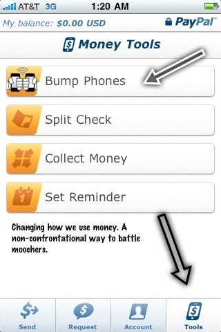
Although they do charge a small fee, something like 2.9% + $ .30 (don’t quote me, I’m just the messenger). With this new option, link your credit card and bank account with PayPal and pay your friends without needing cash.

paypal.png

Mashing-up with Bump, allows users to make paying people just a bit more entertaining. My buddy needed to pay me for a parking validation the other day so we "bumped" phones. Bumps app recently added Facebook integration, the list goes on.

App developers are starting to get very creative with collaboration mash-ups that shared the best technology with the best features and design. Another great example is Occipital, makers of Red Laser. From their site "Occipital, LLC is a technology startup focused on mobile visual search, founded by University of Michigan alumni Jeffrey Powers and Vikas Reddy."

Apps such as Alice.com, Cor.kz, and many others are using Occipital’s Red Laser technology to make product search a lot quicker.

I think it’s great that although the iPhone OS is essentially a close system, developers are teaming up to share and license technology.

Shady Practices in the App Store

BNO News for the iPhone

I’m seeing a new trend in the App Store in iTunes that scares me a little. Charges and (sorta) hidden fees that come along with a paid app. I am limiting this to paid apps because I am under the system of belief that free apps have the right to charge for an added feature set. My first aggravation came along with an application my buddy recommended to me. BNO Breaking News. It was an app that he had found which solved the “I have an idea for an app” conundrum. I don’t why I call it a conundrum, but I’m keeping it. So continuing, he was ecstatic when he found his app for sale. BNO Breaking News is a real simple application that simply sends the user ‘push notifications’ to the user’s iPhone. I was pretty impressed with the idea and that he found an application that perfectly met his needs and expectations. He told me about it and without much hesitation I downloaded it while I was still on the phone with him.

The charges started with the application costing 1.99. Not a bug deal, but I see that number as a paid app that is viewed by the developer as semi-premium. Many of the applications that cost to download “paid applications” are .99. Little differences like a dollar make a big difference. I was not paying a close attention to the fine print in the description, but BNO’s plan was to offer the application at 1.99, with a trial period. To get more than one news update a day a subscription plan is required. For a year’s worth of news pushed to my iPhone it would cost a total of $13.97. In my opinion it’s just not that good of an application to call for a $14 price tag.

The part that really got me fired up enough to write a negative review for the app was that there was a change in the application in an update. Conveniently, BNO added an account button inside the application. There really is no real reason to enter the application otherwise. Just make sure push is enable in settings, and the app just sits there. I consider this bad design, and that’s being kind and rational. I look at this as a hidden charge which I refer to as an app store bait and switch. So, unfortunately there is an application on my phone which is useless. I am not willing to pay $13.97 to use this application, being under the impression that 1.99 was the real price. But with the faceless customer service and developer support that is the iTunes App Store, I think this kind of ethically challenged business practices will continue for sometime.

The combination of one-click, impulse buying together with faceless customer service, makes screwing customers easier developers. It’s just good business.